Rebranding Mater Hospital Foundation
Client: The Mater Hospital Foundation
Project Information
- Branding,
- Tagline,
- Brand Guidelines,
- Print,
- Digital,
- Experiential,
- Signage
The Challenge
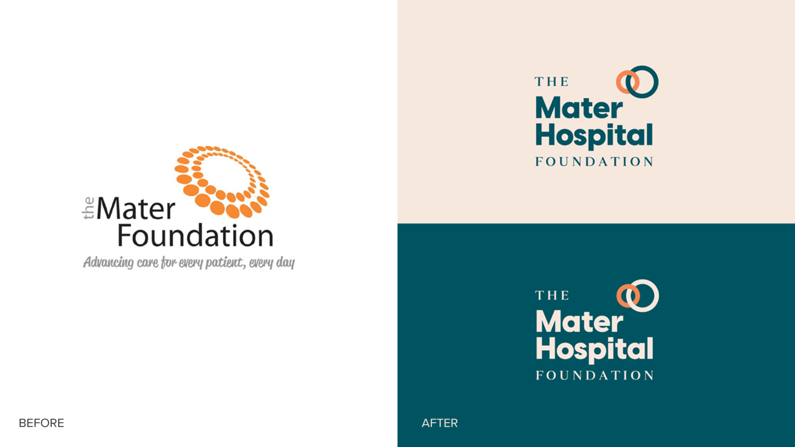
The Mater Foundation first approached Bossanova to create a set of robust brand guidelines to help them manage their brand and achieve consistency across communications. As they were changing their name to The Mater Hospital Foundation, we suggested it was an ideal opportunity to take a fresh look at their identity and collateral.
The Response
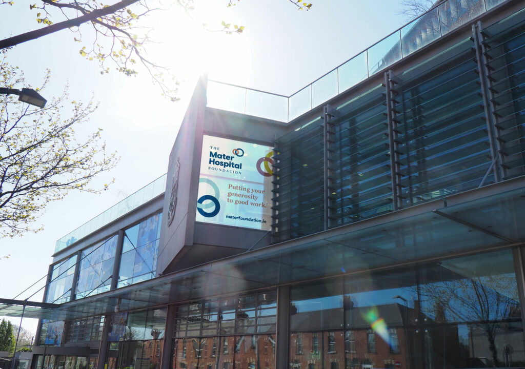
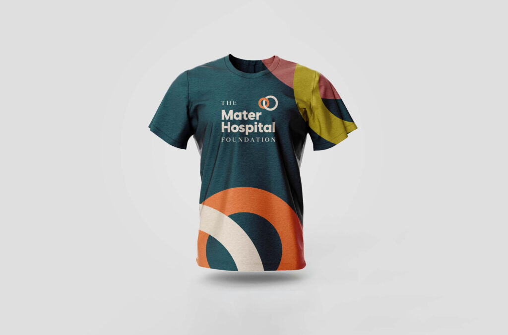
A new symbol of interlinking circles was created to represent their existing proposition of a community pulling together in a unified, supportive, caring, and organised bond. A warm, contemporary colour palette was introduced to complement a more sophisticated orange. With the introduction of ‘Hospital’, typography was also explored to improve balance, form, and structure. In application, the brand symbol lends itself to a flexible and dynamic graphic device as a backdrop or holding device for images and text. To mark the brand’s new chapter, we created a differentiating tagline – ‘Putting your generosity to good work’.
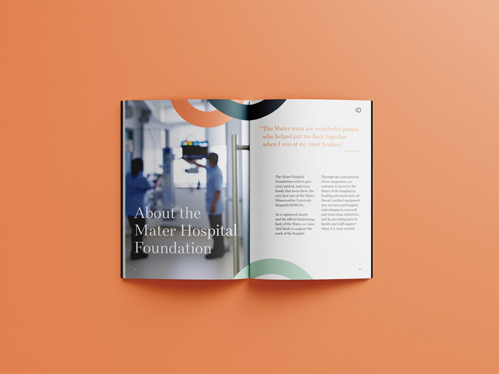
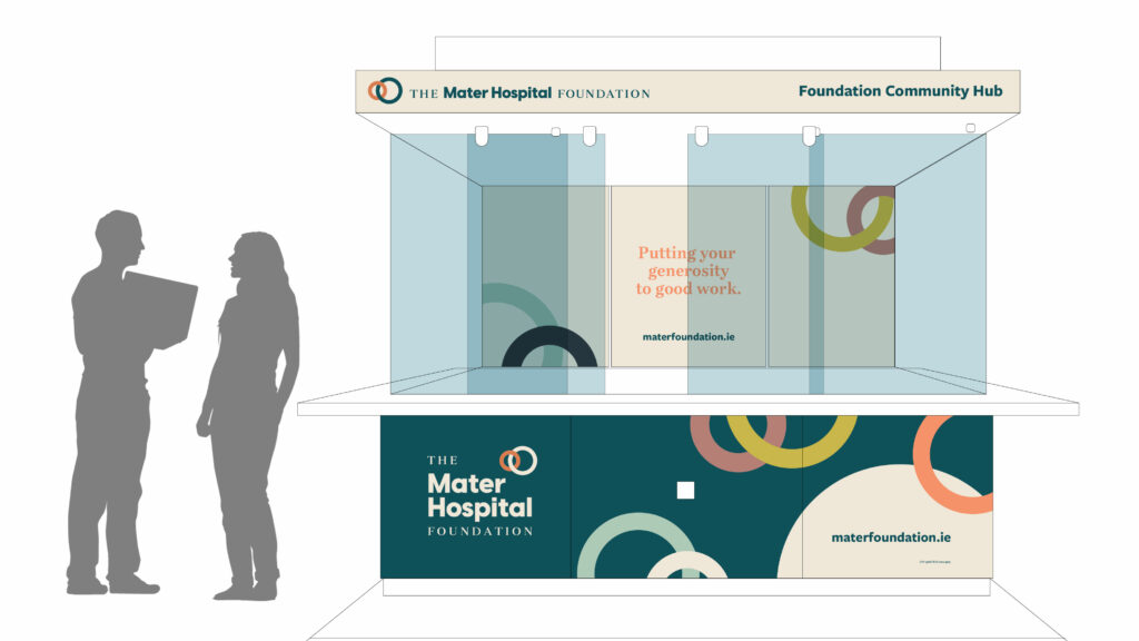
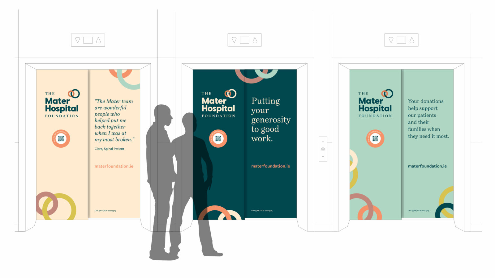
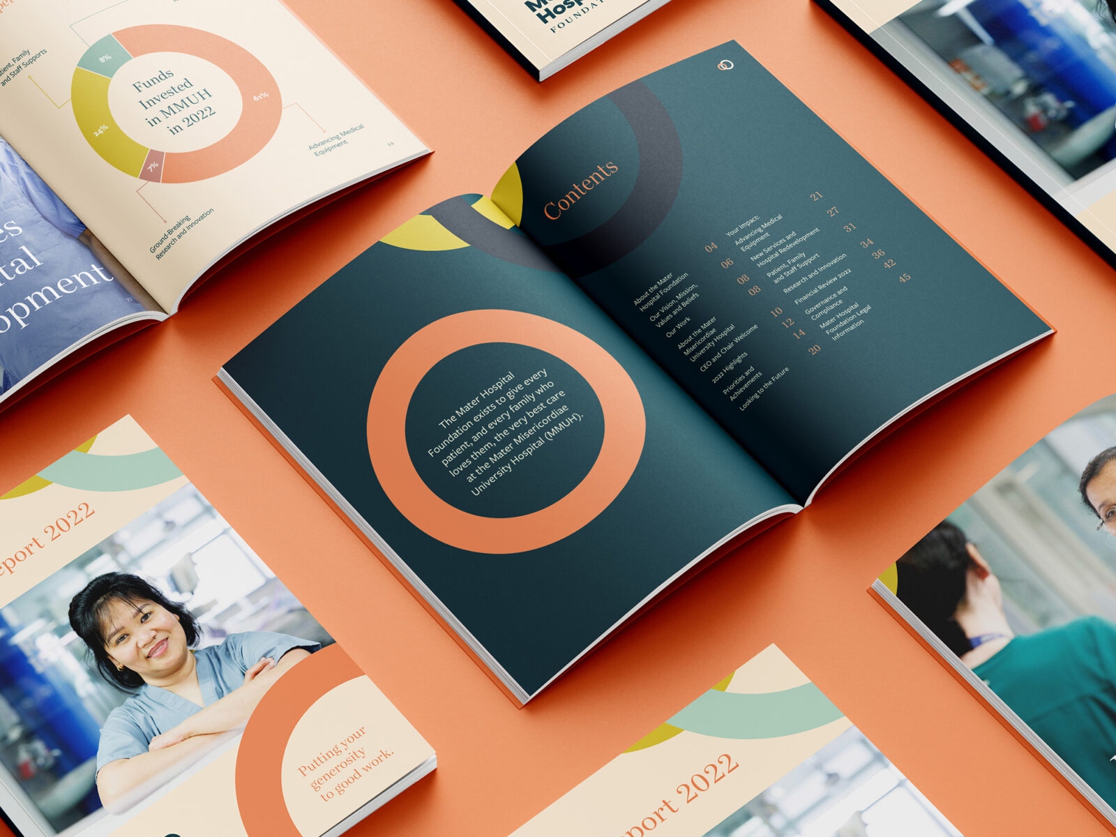
Application and roll out included a comprehensive set of brand guidelines, corporate suite, and marketing collateral. Hospital lifts are now more uplifting (sorry!) with clear messaging, patient testimonials and a QR code to invite donations to the foundation. What was once a drab information booth is now an inviting ‘Foundation Hub’ buzzing with activity and a focal point for visitors to find out more about the foundation’s work and how they can get involved. Our most recent project was the design of their Impact Report highlighting the great work achieved to support The Mater Hospital and their ambitious plans for the future.
