Refreshing a much-loved nursery brand
Client: Baby Elegance
Project Information
- Brand Refresh,
- Brand Guidelines,
- Corporate Suite,
- Print,
- Digital,
- Packaging,
- POS,
- Signage
The Challenge
Celebrating 40 years in business and 10 years since we completed their first brand refresh, it was time to take another look at Baby Elegance to future proof the brand and ensure it stays modern, relevant, and appealing to its key target audience – mum at ‘bump’ stage.
The Response
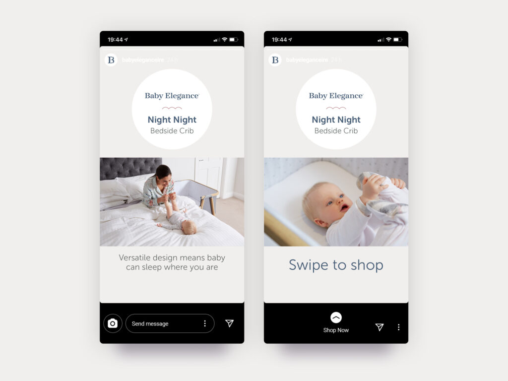
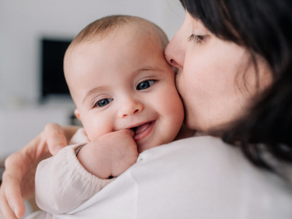
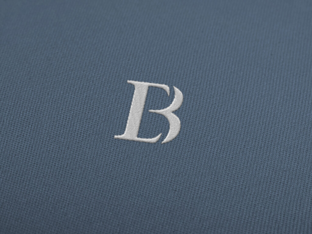
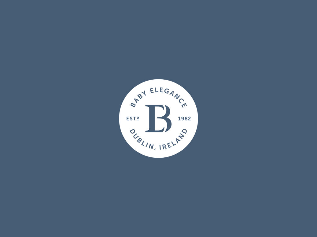
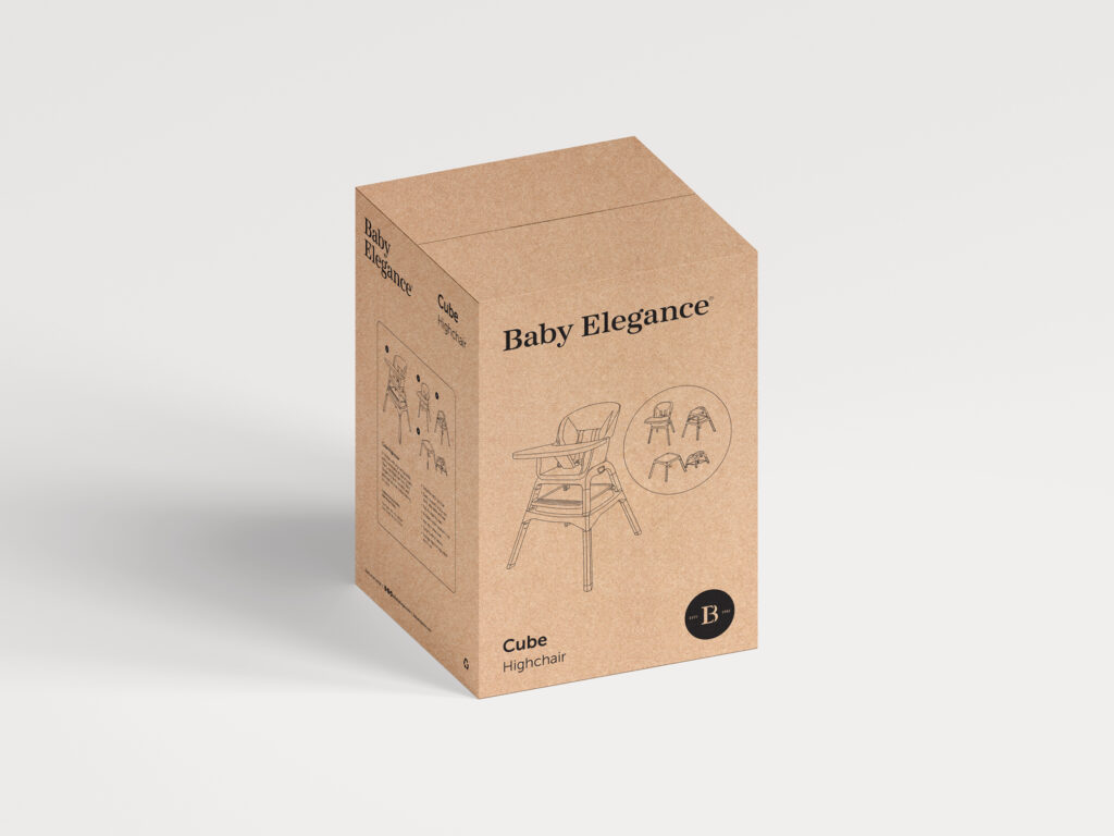
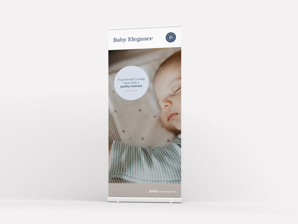
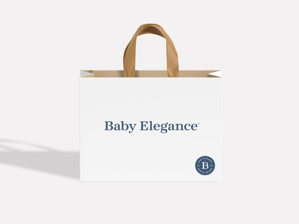
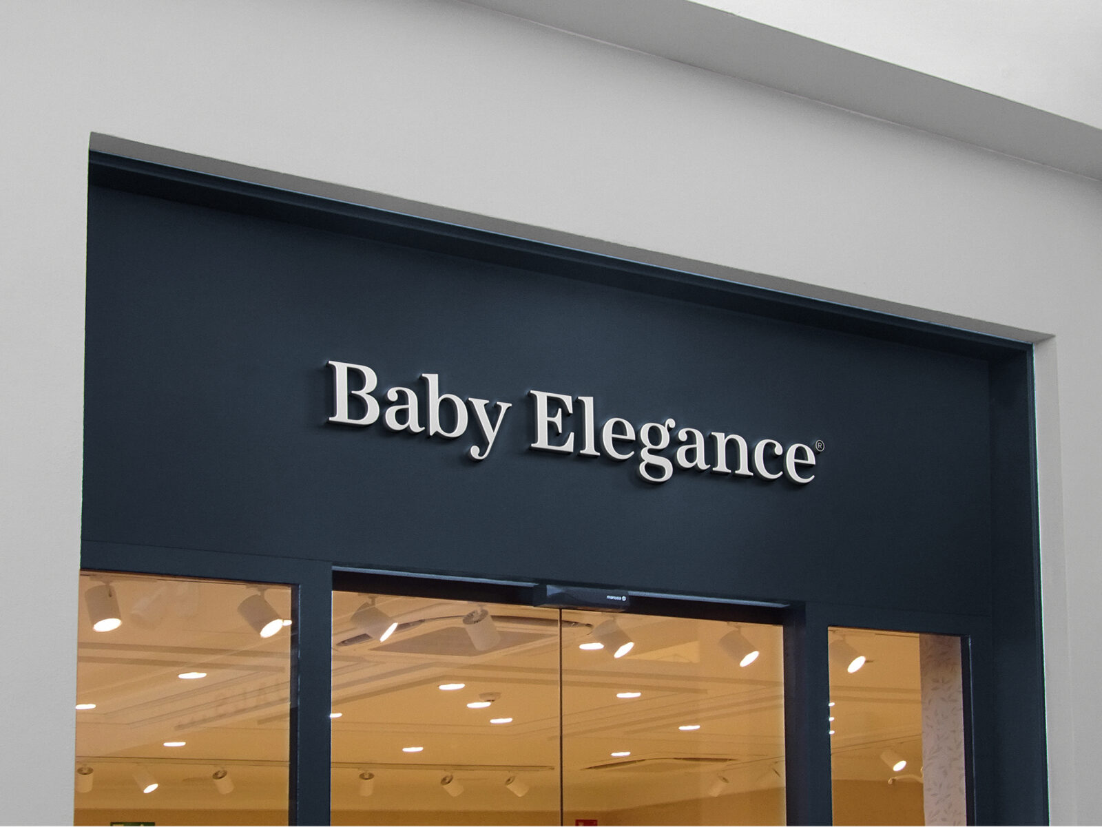
A stylish, minimal brand identity was created using letterforms that feel organic, inviting, and elegant. A supporting monogram “BE”, (shaped to resemble a baby bump) is used as a quality ‘stamp’ to highlight the brand’s heritage and story. The primary colour palette is sophisticated and gender neutral while the supporting palette gives a pop of colour to soften and surprise. A soft illustration style was created to complement warm, ambient photography in application.
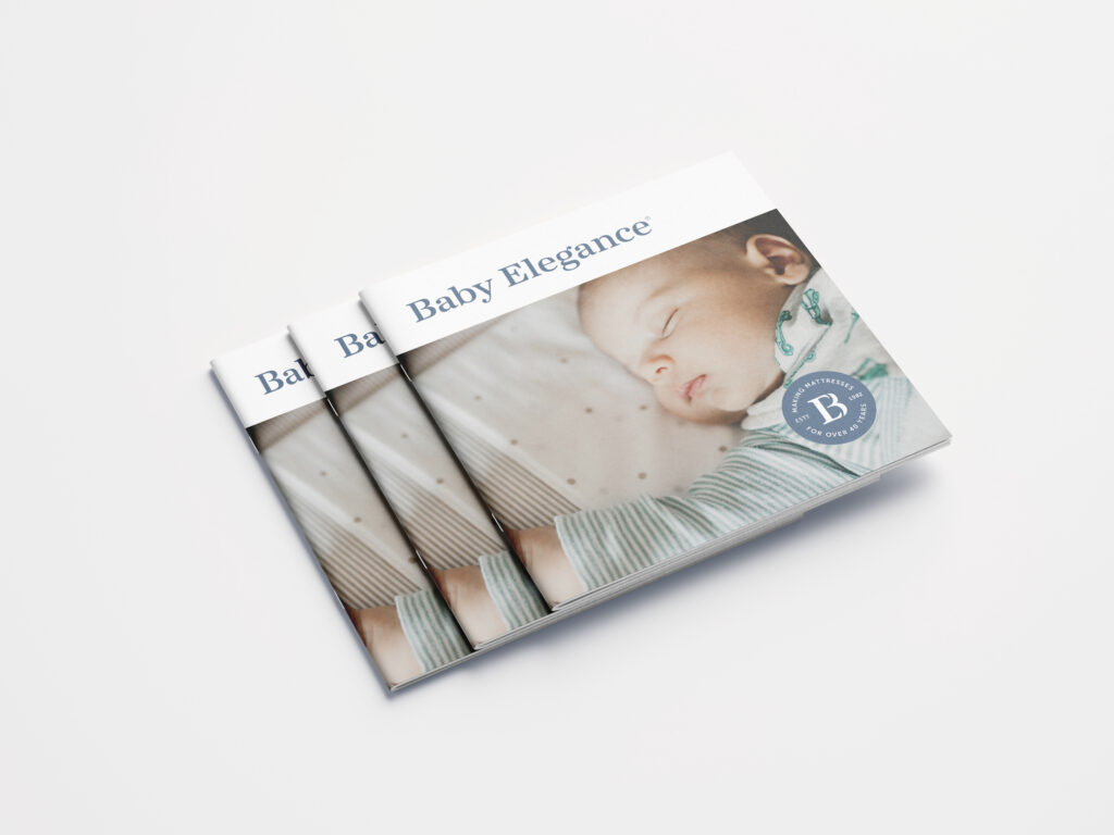
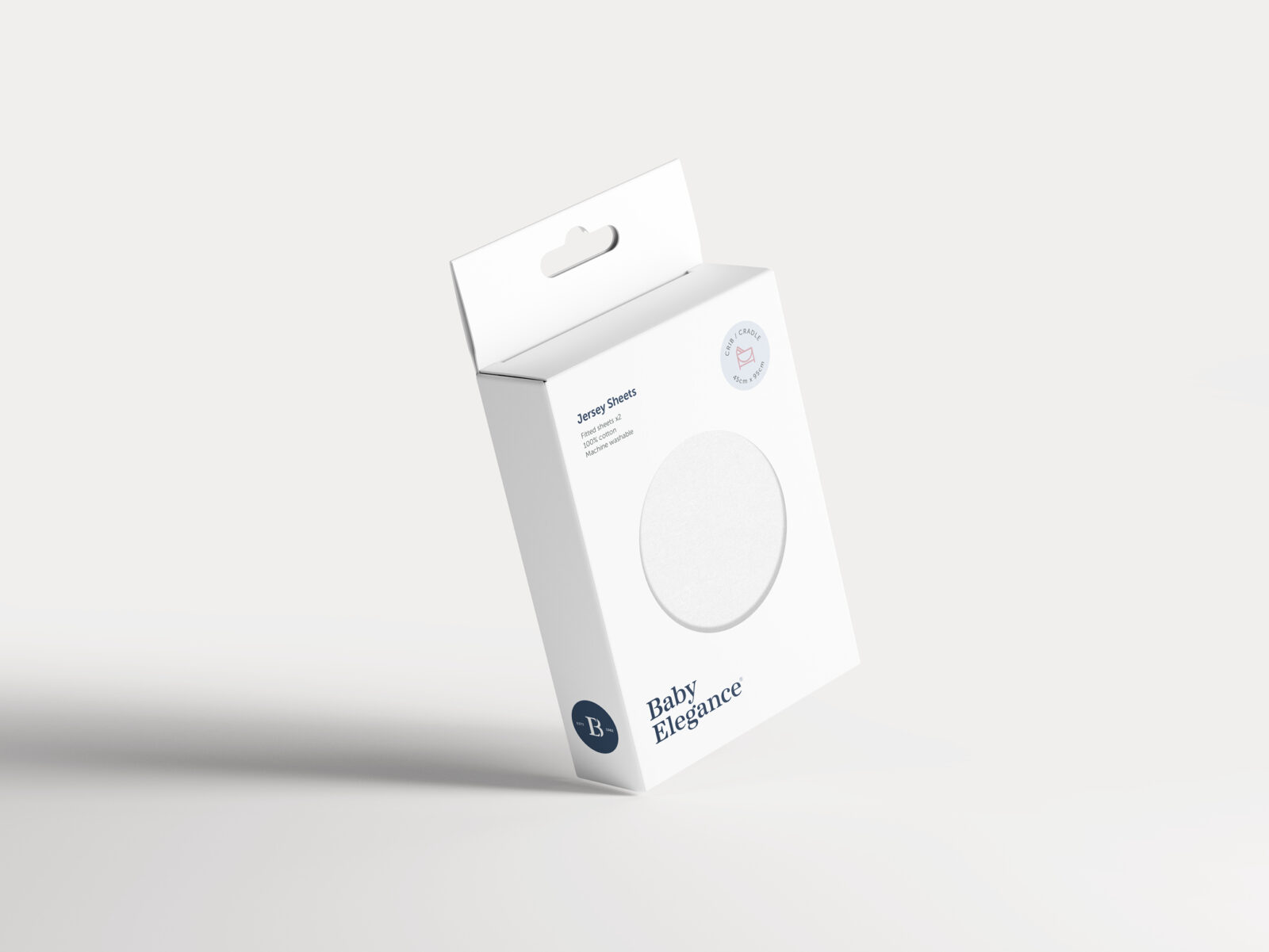
A clear and consistent design system for own-brand product packaging sees Baby Elegance take centre stage and is designed to work across their many product lines. With a refreshed look and renewed focus, this family owned, Irish brand continues to grow and scale to become Ireland and UK’s best loved nursery brand.